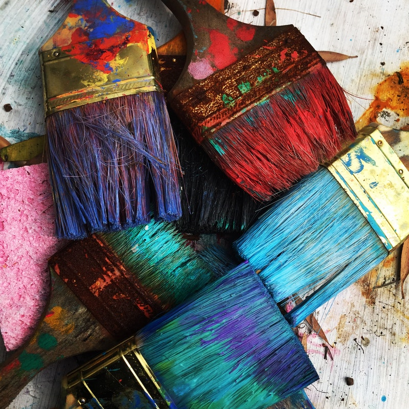
One of my favourite parts of fixing up my house has been the decorating aspect. In particular, choosing paint colours to express myself and create the right mood and energy for each space. However finding the right paint is another matter altogether. In order to figure out which shade will work best in any space requires a little bit of fine artistry so I chatted to Victoria, owner of The Colour Retreat for a few gems of wisdom when it comes to choosing a paint colour – whether it be on a brick feature wall, weatherboards or bedroom, the principles are the same…
I know the sampling process is fun and can give you a sense of satisfaction that you project is becoming more of a reality. But there are some common mistakes people make in choosing a paint colour that can have you feeling like you’re going around in a circle and overwhelmed with choice. So here is how I help to break it down to my customers.
Do your research first.
Before you start collecting paint chips or purchasing sample pots, do some free research to see what others are using. Flicking through design and home magazines and lifestyle apps such as Pinterest and Instagram are a great source of inspiration. And if you are looking at colours for outside of your home, take a walk around the neighbourhood to see what others are using. Don’t be afraid to knock on the door and ask someone what colour they have used. Imitation is the best form of flattery!
If you notice any reoccurring colour themes in your research, then it’s time to start to find these similar shades in colour chips from your local paint shop. When you have them all laid out alongside each other it’s amazing how quickly you will whittle it down to a smaller number of options.
One of the first things to consider when you’re narrowing it down is whether you prefer cooler or warmer tones. This is one of the first questions I ask when I meet new customers. Warm colours are your reds, yellows, oranges etc. Cooler tones are blues, greens, and purples. Knowing your preference makes it easier to hone your search. However, while it’s easier to decide on the right tone when you are dealing with true colours, I know it’s tricker when looking at neutral colours such as whites and greys to determine the ‘base’ colour.
To do this, arm yourself with a colour chip of an untinted white base (I always use Dulux Vivid White) and place it against one colour chip at a time. It’ll become clear what base colour you are dealing with. If you’re unable to figure it out for yourself, you can always enlist the advice of paint shops that have in store colour consultants or someone you know that has experience with interior design.
At the end of this process you want to ideally land on two or three (at most) colour chips. These can either be differing strengths of the same colour, completely different colours or a warm and/or tone option. It’s up to you!
Take a small sample.
Once you are clearer on your top 2 or 3 colour options, then it’s time to purchase sample pots. Not only will a short list of colours help to avoid getting overwhelmed, it will help to save you some cash. These days, sample pots cost between $8 to $12, so if you aren’t lucky enough to find the right colour straight away it can be an expensive exercise.
You may still have to do another round of colour sampling (with test pots), however you have taken the time to consider your colour choices and therefore should be feeling more at ease.
Top tip: If you didn’t want to purchase sample pots at all, paint manufactures typically have A5 and A4 sheets of paint colours you could get your hands on. Though, to get these you will have to contact the manufacturer directly and some may attract a fee for production and postage.
Action time: the 7 rules of colour sampling.
Once you have your shortlisted sample pots then follow these rules to help you land on the colour that’s just right for your project.
- Give the sample pot a really good shake before you apply it. It’s important the tinting pigment is mixed through before you paint to avoid streaks.
- Sample areas need to be around a square meter. This will allow you to gauge a better understanding of how this colour will look on a larger scale. You can paint directly on the wall or on an artist’s canvas.
- Always apply 2 coats (on a bare/un-primed surface this may mean 3 coats). This ensures the colour is being seen at its full intensity. No patchiness allowed!
- Don’t sample differing colours right next to each other. Let’s put the point of your sampling in perspective here… You’re looking at how this colour compliments your space NOT how it reacts with the other colour you’re sampling. Separate them! 😊
- Sample in multiple areas of your house and leave for at least 24 hours. Don’t be afraid to sample next to artwork, furniture or windows. Again, this will allow you to gauge a better understanding of how this colour will look on a larger scale and how it reacts to light (passing, natural and artificial) and your existing furniture and fittings.
- Apply your sample in the same technique as your top coat. Technique will affect the overall finish. If you’re rolling your top coat then please do this with your sample.
- Most importantly, if you don’t like the colour/s you’ve sampled it’s important to ask yourself “Why isn’t this working for me?” The reason for a colour not working could be that it is “too light” or “throws off a blue undertone when placed next to my carpet”. This can be easily rectified by adjusting the strength of a colour or eliminating those colours which are of a particular base.


